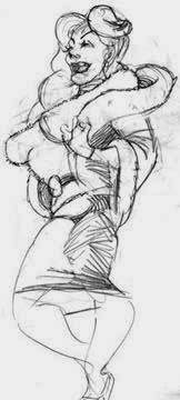
Continuing my lesson on making characters more flexible:
3) Another trick to keep
the figure a subject of interest was used heavily by artists and sculptors
during the Italian Renaissance: contrapposto. While the top part of the
body faces one direction, the hips are twisted in another. This is especially
effective in sculpture, because the figure forms a beautiful 'picture' from
whichever direction the spectator views it. In drawings, the technique is
rather snake-like in appearance, creating an unpredictability; one never knows
how the figure will 'end up' from head to toe.
4) One can also
occasionally strive to indicate that the viewer's POV is slightly above or below
all or part of the figure, as in my attached glenda.jpeg, where the POV is
definitely from below, giving a unique, foreshortened angle to the shoulders,
breasts and skirt.
This gives your audience a surprise, keeping its interest.
The quality I aim for in my own cartooning is surprise; in composition; in
figures; in content.
It should be remembered
that as we discuss all this twisting and turning, a stiff, doll-like approach
to the figure can still be used to great effect. I use it in the sketch
below. This type of stance provide a bald expose of the character's essentials.
"Here I am, now what are you gonna do about it?"
After these words, I apply comments, hints, and quick
sketches to three of the student's own drawings: "The legs of the figure
in the foreground lack construction, bulging in a way that suggests
improvisation[---]wonderful in itself, but in my quick-n-dirty jotting, I've
gone a bit literal and indicated more definite shapes & joints to them. They
are unrealistic, but supple because they are constructed in pieces with joints
connecting them. A more definite illusion of walking could be achieved by
indicating the slightest swing to the arms. The head is cast slightly downward,
and there's more of a lean to the body. The waist is bent forward, and therefore, the line
indicating division of shirt& pants is curved as if seen from above."
"For my sketch
addressing your pedestrian [---], I've employed a lower POV as mentioned in the
lesson. The man's shoulder closest to us is higher than the other. Arms and
legs are all given slight inward curves to indicate that they have weight and
are being lifted. The cuffs of his shirt and pants resist slightly, and hang
down, also being of matter, and therefore, weight."
If you are interested in lessons from an affable 30+ year cartooning veteran, please PM me at miltonknight@earthlink.net; $25 per lesson/subject.
If you are interested in lessons from an affable 30+ year cartooning veteran, please PM me at miltonknight@earthlink.net; $25 per lesson/subject.
Twistingly Yours, MK
COPYRIGHT 2013 BY MILTON KNIGHT


No comments:
Post a Comment